Originally published on August 31, 2024
This August has been the most fruitful month developing Sad Land since I can remember. Waking up early to focus on game development has led me to more clearly focus on the project and push forward some mechanics I’d been putting off coding for at least a year. The first is a more complex dialogue system that allows for longer and more interesting dialogue choices. The game in my mind has always been one that would have branching dialogue options as one of its core features. The dialogue system I implemented initially was too simple for what I had imagined for the game, but as I dug deeper into development, I put off this dialogue system overhaul for as long as I could. It wasn’t until last month when I played through the 2018 surrealist-horror indie game Paratopic that I knew I had to implement a more robust dialogue system for Sad Land.
Paratopic, a short story of a game where you “smuggle contraband VHS tapes across the border,” is like if David Lynch and David Cronenberg got together to make a short game to throw on a PS1 demo disk. It plays less like a conventional game and more like a hypnogogic film that cuts in and out of scenes where you interact with your surroundings in a variety of simple ways: talking to the only available NPC, taking pictures out in a field, or switching the radio dial between incomprehensible talk radio and synthy musak.
Paratopic, a short story of a game where you “smuggle contraband VHS tapes across the border,” is like if David Lynch and David Cronenberg got together to make a short game to throw on a PS1 demo disk. It plays less like a conventional game and more like a hypnogogic film that cuts in and out of scenes where you interact with your surroundings in a variety of simple ways: talking to the only available NPC, taking pictures out in a field, or switching the radio dial between incomprehensible talk radio and synthy musak.
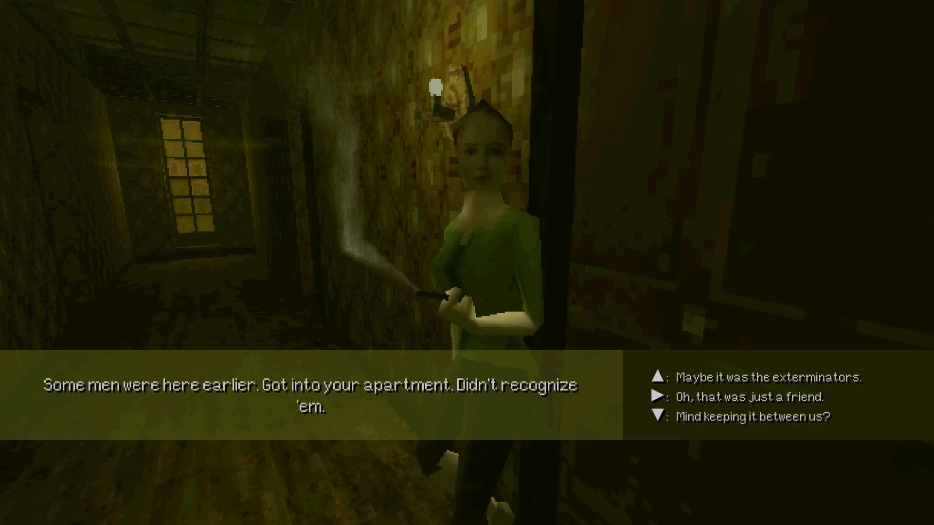
Their dialogue system isn’t anything new, but seeing how well it works within Paratopic’s slower pace and minimalist approach gave me the motivation to cut through the procrastination and improve the stale system I’ve been working with. Many items on my to-do list start as one item (rehaul dialogue system) before expanding into several goals that need to be tackled one at a time (design dialogue system in Photoshop, create sprites to import into GameMaker, create data structures to facilitate new dialogue object, animate sprites/text for new dialogue object, integrate new dialogue object into old dialogue system, troubleshoot, troubleshoot, troubleshoot). Below is an example of the product of many mornings of work and frustration.
There is nothing more satisfying than booting up a test build of Sad Land and realizing that I’ve successfully coded an intricate game object and that it may never have to be touched or fiddled with for the rest of production.
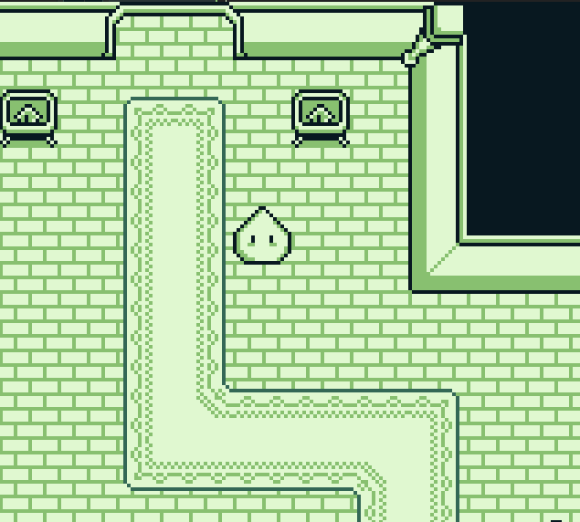
Another new feature I’ve added is the ability to shift into a first-person perspective to view certain objects.
Another new feature I’ve added is the ability to shift into a first-person perspective to view certain objects.
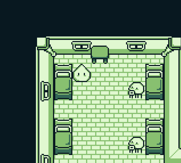
The image in the example above is not polished or finished, but the mechanic to present this new perspective has been coded and is ready to implement. I’m not sure how heavily it will play into my puzzle-design moving forward, but allowing the player to look out windows or look at a painting up close expands the possibility space for immersion that will set it apart from other Zelda-likes out there.
Not only was this past month a productive game development month but I was also took my annual weeklong vacation where I rent a house with some friends, disconnect from my phone and computer, and give myself a lot of space to relax and unwind (have I finally reached a work/life balance? Is that possible? Or is striking that balance a constant struggle?). I usually bring along a few books to choose from and John Romero’s recent memoir DOOM GUY: Life in First Person was the one I picked up and couldn’t put down. You may know Romero as the co-creator of DOOM, a fast-paced pseudo-3D first-person shooter game that changed the entire gaming industry when it came out in 1993. As someone that loves Halt and Catch Fire and any book that explores the intricacies of game development, it was perfect book for me to get lost in.
Not only was this past month a productive game development month but I was also took my annual weeklong vacation where I rent a house with some friends, disconnect from my phone and computer, and give myself a lot of space to relax and unwind (have I finally reached a work/life balance? Is that possible? Or is striking that balance a constant struggle?). I usually bring along a few books to choose from and John Romero’s recent memoir DOOM GUY: Life in First Person was the one I picked up and couldn’t put down. You may know Romero as the co-creator of DOOM, a fast-paced pseudo-3D first-person shooter game that changed the entire gaming industry when it came out in 1993. As someone that loves Halt and Catch Fire and any book that explores the intricacies of game development, it was perfect book for me to get lost in.
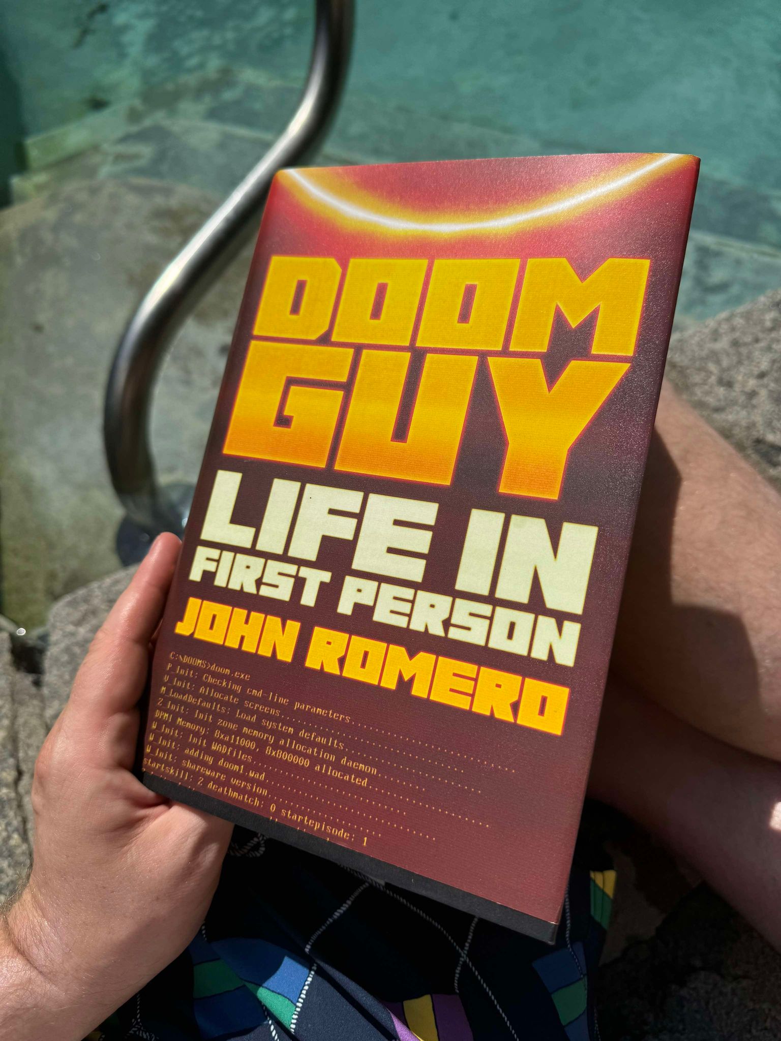
Being on vacation and soaking in the summer heat has been drumming up memories of my 2022 trip to Disneyland and I was delighted to find Romero had something to say about the subject:
Looking back at my younger visits, both as a five-year-old and as a teen fresh from high school, I wonder, did the park resonate so powerfully with me because everything about it touched on the same elements as game construction or vice versa? Did Disney influence me as a game designer, or did I like it so much because I was one? Every inch of Disneyland is meticulously designed so that visitors have not just a shared experience, but the same experience. Consider, detail and planning go into every aspect of the park to heighten expectations and deliver even bigger payoffs. If the Matterhorn inadvertently opened my eyes to Disneyland’s constructed illusions, I saw their mastery when I was older. From the level design of the waiting lines to the color and shapes of its buildings, the experience design in Disneyland is magnificent. Imagineers – Disney designers – deploy techniques to create illusions. For example, Main Street grows narrower as it nears the castle, making the building seem much bigger than it is.
It wasn’t until visiting Disneyland myself did I get to see this uncanny and meticulous design up close. On a macro level, the park has firm and simple design elements at a foundational level.
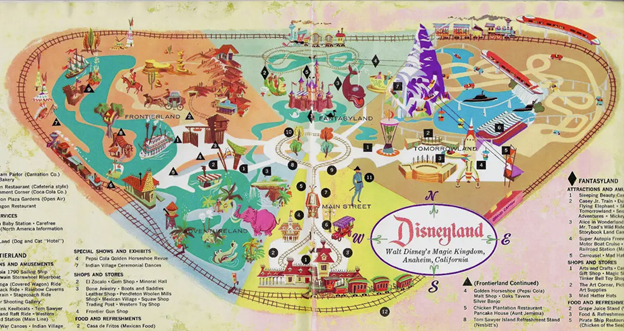
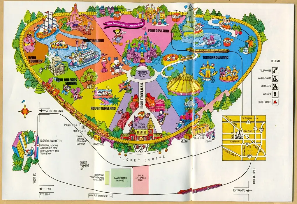
An map of Disneyland from 1959 retrieved from themeparkbrochures.net
The park entrance starts you on Main Street, U.S.A., a broad thoroughfare populated with gift shops, cafes, and Disneyland City Hall. This dense area, inspired by the small-town Main Streets of early 20th-century America, primes patrons for the Disneyland experience by presenting ornate buildings and a dose of nostalgic Americana while initially obscuring the more fantastical elements of the park. All but Sleeping Beauty’s Castle, positioned a quarter mile at the end of the long, flat walkway, drawing your attention, hinting at what is yet to come, and giving you a clear destination. Main Street, U.S.A., is a tutorial stage.
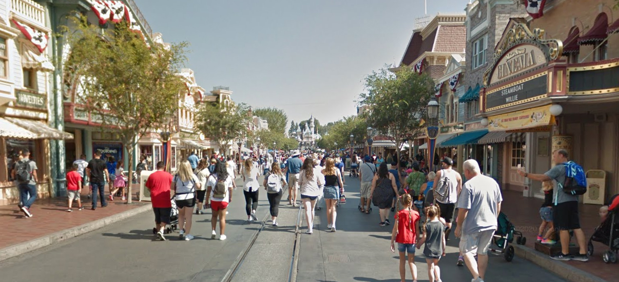
Google Street View of Main Street, U.S.A.
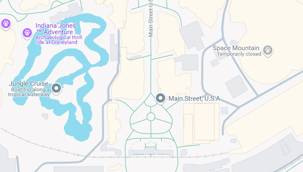
If you look closer at a map of the park, you can see to the left of the street is the Jungle Cruise ride and to the right, Space Mountain. You might think that either or both of these would be displayed when you enter the park as a way to get guests excited about the eclectic range of amusements Disneyland has to offer, but instead the buildings of Main Street, U.S.A., tactfully shields these rides from view, keeping them sequestered to their own themed areas. This type of obfuscation is present all over the park, functionally keeping you transfixed by your immediate vicinity and drip feeding you the park little by little.
As you continue to walk toward Sleeping Beauty’s Castle, you will first encounter Central Plaza, Disneyland’s central hub. This open garden presents photo-ops and offers several paths to choose from. Many children visiting the park for the first time will want to take pictures in front of the castle and visit Fantasyland first, but on my visit we made a b-line to Frontierland to ride Big Thunder Mountain Railroad.
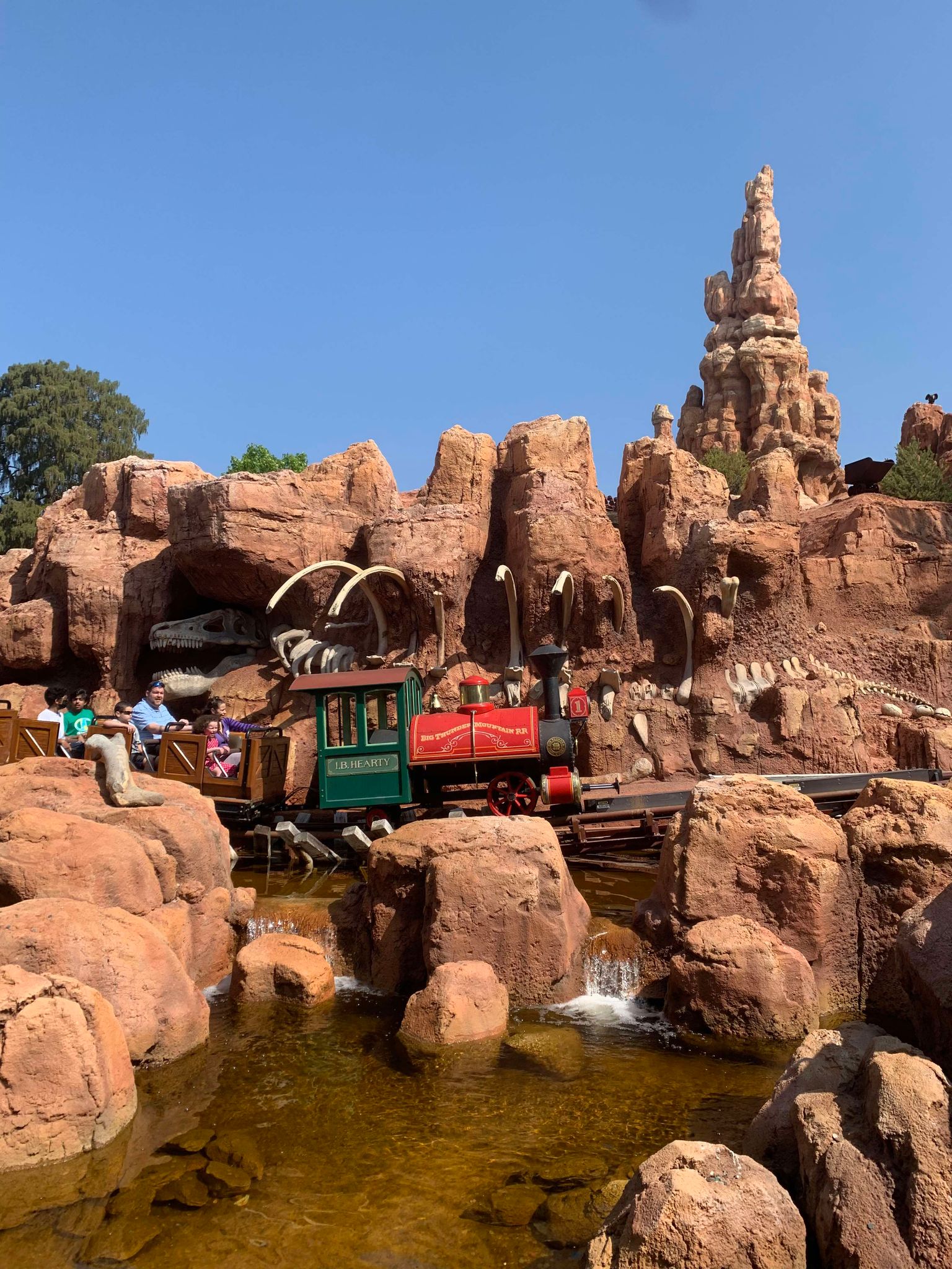
I only took a dozen or so photos at Disneyland and for some reason chose to capture Big Thunder Mountain Railroad. So here it is in all its glory.
You may ask, “why rush to Big Thunder Mountain Railroad?” Well, I was at the park with someone who knows the ins and outs of the Disney Genie system that helps guide your visit with a digital itinerary that cuts down on your time waiting in lines. In a 21st-century gamified Disneyland experience, using the app to ride the most rides possible is its own meta-game. For more information on this subject, I highly recommend Defunctland’s Disney's FastPass: A Complicated History, an entertaining and well-researched feature-length documentary on the subject.
Disneyland map printed in 1982, retrieved from themeparkbrochures.net
If Main Street, U.S.A., is the tutorial, Central Plaza is the Stage Select screen. Each path branching off the hub presents visual cues to entice attendees and show them what that area has in store for them. The simplicity of this design, with its straightforward paths and large, eye-catching monuments and signage, is intuitive design that even a distracted child could navigate.
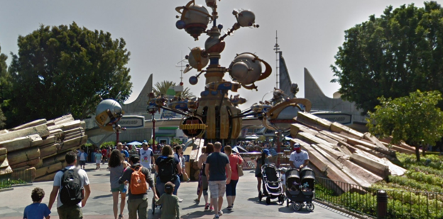
Google Street View of the entrance to Tomorrowland as viewed from Central Plaza
Many aspects of Disneyland’s design echo throughout the environmental design of video games: deliberate pathing, memorable landmarks, zones with clearly defined edges (wall, cliffs, bodies of water, etc.), and repeated use of hubs/intersections. As you may already notice, these concepts aren’t unique to entertainment spaces. Nicolas Oueijan, founder of Strafe Studios who also has advanced degrees in Architecture and Design held a fascinating presentation at the 2021 Game Developer’s Conference titled Stop Getting Lost: Make Cognitive Maps, Not Levels where he outlines all of these concepts in great detail.
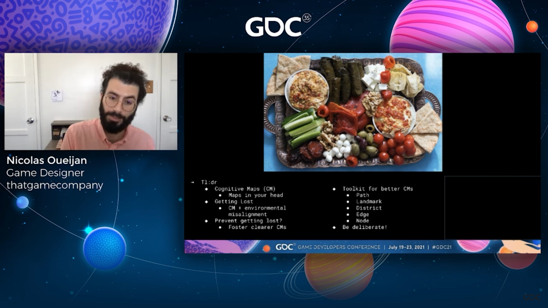
The entire talk is worth a watch whether or not you plan to build your own physical/digital spaces but the way he chose to close the talk has been running through my mind since I first watched it a few months back. With his design notes on screen alongside a tray of food, he says:
I’ve included this lovely food tray here, because I could take the same food tray with all of those same ingredients and just kind of like mix it all up in there so everything’s all up on top of each other and blended, but it wouldn’t be as appetizing, first of all, and secondly, it wouldn’t be as memorable to me. It would have the same nutritional value but by virtue of the way it’s organized, it’s not going to read as clearly. And with this one, you know I can do my squint tests (the act of squinting at your map to see if it is still readable) and I can begin to start making out districts, I can kind of start to make out landmarks even with this food. You can really apply these design strategies to nearly everything.
One thing I’ve learned from my years of building out Sad Land in my spare time is that you can’t iterate on something with a weak core design. This is why in figure drawing you learn to start with shapes and add detail from there. The architects behind Disneyland had the foresight to start with strong design elements and had the cashflow to polish and design all other elements of the park. With an interest in keeping the core design strong and a love for small, polished details, I hope to release something that captivates people. Keeping the graphics as simple as they are is part of my core design philosophy, making sure chasing denser or more complicated graphical elements doesn’t delay the project to the point that it doesn’t reach the light of day. To reference the Sad Land images at the top of this newsletter, the way the dialogue box elements slide into frame and the way the game incrementally fades to black before revealing the first-person view were small details that I found just as important to get right as anything else.
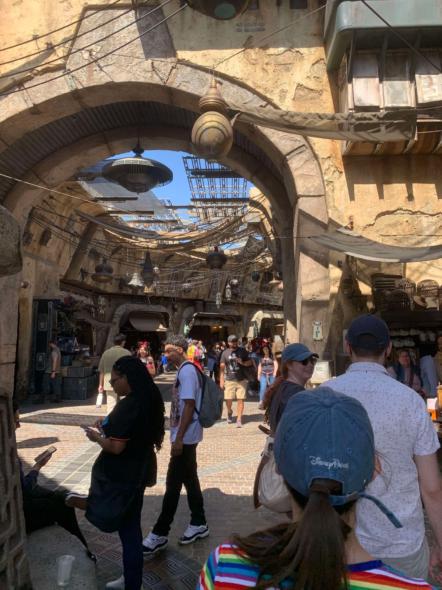
Back in May, Jenny Nicholson, a YouTube creator who generally makes content about theme parks and pop culture, released a four-hour video called The Spectacular Failure of the Star Wars Hotel. This may sound niche but the video as of the time of writing this has over 10 million views on YouTube and was covered by The New York Times, Forbes, CNN, NPR, and Rolling Stone. Jenny always puts out phenomenal work, but I think this video in particular attracted so much attention because it highlights something you don’t often see, a complete and meticulously researched dissection of Disney dropping the ball with an idea that seems so difficult to mess up (despite the best efforts of the cast and crew).
Additionally, the attraction was open for such a short amount of time and was so expensive to visit that most people would never be able to afford the trip even if they wanted. I bring this up here as this is an example of what can happen with loosely defined core concepts and unfinished design elements. It’s a true spectacle to watch Disney fray under the weight of its own gluttonous expansions.
Throughout my childhood my dad would bring me along to work with him on weekends in the summer. It was often to help landscape large yards in well-off neighborhoods on Cape Cod: weeding, pruning, clearing brush. I remember him walking me through the layout of one of those yards and explaining how different sectioned off areas were “like different rooms in a house.” One area might be for the flowerbed, another with chairs and a dense canopy. The idea of those different rooms excited me as a kid. I recall crawling around through the leaves between the large branches of a fallen oak tree behind my friend’s house off in the woods. The empty pockets between branches were given room names like the ballroom, the library, the kitchen. I looked up at a dead tree and saw a mansion, my mind making sense of the imagined rooms in this natural organic space. I like to think that spark is what carries over in my interest of this type of design today.
With August winding down, I’d be remiss if I didn’t share this quote from Tuck Everlasting by Natalie Babbitt. It gets circulated online a lot this time of year and I love to read through it every time I see it reposted:
I’ve included this lovely food tray here, because I could take the same food tray with all of those same ingredients and just kind of like mix it all up in there so everything’s all up on top of each other and blended, but it wouldn’t be as appetizing, first of all, and secondly, it wouldn’t be as memorable to me. It would have the same nutritional value but by virtue of the way it’s organized, it’s not going to read as clearly. And with this one, you know I can do my squint tests (the act of squinting at your map to see if it is still readable) and I can begin to start making out districts, I can kind of start to make out landmarks even with this food. You can really apply these design strategies to nearly everything.
I hope you’ve had an equally packed summer with time to move forward and time to relax. For the last few months, these newsletters have been more grounded in the physical world and history. Next month I plan to pivot and delve into the topic of speculative games and fanart.
Sincerely,
Neil
Sincerely,
Neil