Originally published on Arpil 30, 2024
This month I set up a new spreadsheet to set clear goals for myself with clear deadlines with the hope that this will keep me accountable and on track to release the demo for Sad Land before the end of 2024. We’re already 1/3 into this year and I can see 2025 off in the distance, creeping closer and closer by the day. I've tracked progress using a Trello, post-it notes, a checklist in my notebook, and now I'm moving to this spreadsheet, which is fairly close to how I've tracked progress working page-by-page on my comic projects.

As I see it, there are three aspects of creation that you work through while managing an artistic project: 1) Your own artistic vision, whether it be a hazy notion or a conceptually complete idea; 2) Your own artistic style or limitations that will either alter or hinder your progress as you explore your artistic vision; and 3) The current state of the project and how it lines up with your artistic vision while keeping your limitations in mind. There are many times through the course of this project I’ve “completed” some aspect of the game only to decide that it needs more work. This tweaking and revising can go on forever without some system to reign it in and keep the project on course.
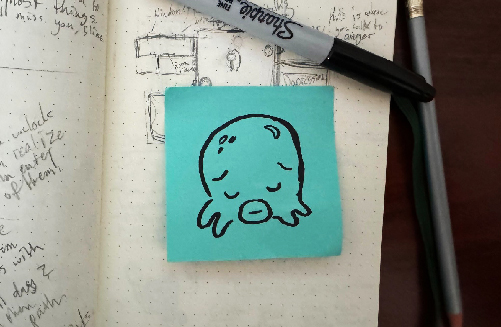
I’ve chunked the game into five unique areas (the working demo has become much longer than initially intended but that’s a topic for another newsletter) and I am moving through each section month-by-month to try and keep my focus on completing one part of the game, giving attention to certain things that I’ve been putting off. It’s very easy to pick away at one simpler aspect of design while ignoring others that carry with them the promise of hours digging though code or cobbling together a precisely timed out cutscene. Game development has been very rewarding but difficult in many ways I didn’t expect. One example of this is designing the tilesheet for the cave walls in an early area of the demo.
BUILDING WALLS AND TEARING THEM DOWN
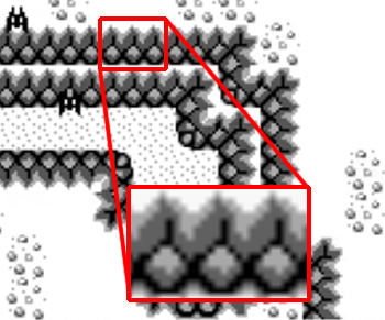
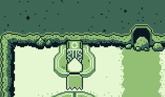
The cave walls in The Legend of Zelda: Link’s Awakening are simple and elegant. The repeated pattern depicts a crack in the cave wall and a rock at the base of the tile. Two tones of grey shade the wall, adding depth to the pattern and acting as an unbroken connective tissue, unifying the wall as one continuous surface. The lighting of the wall is white at top, hinting at a top-down light source, and darkest at the bottom, the dark shaded rocks at the base of the wall acting as a clear boundary along the white speckled floor. I spent more time than expected studying this repeated 8x16 tile but felt the need to understand which aspects I wanted to carry over to my own walls and which design elements I could do without.
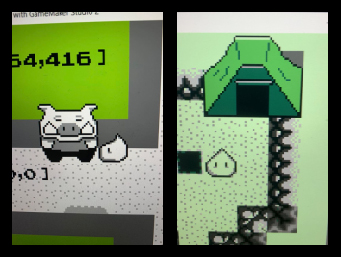
Early photos of my progress of Sad Land in 2021: before implementing any wall tilesheets (left) and after implementing a placeholder cave wall tilesheet (right).
Checking the tilesheets of my backup save files, I can see that I implemented the Link’s Awakening walls into the Sad Land project in April of 2021, made my first attempt at my own cave wall that September, and after several iterations, landed on a design I was happy with by November. The image below shows every iteration I worked through, starting with the oldest at the top and ending at the bottom with my near final version.
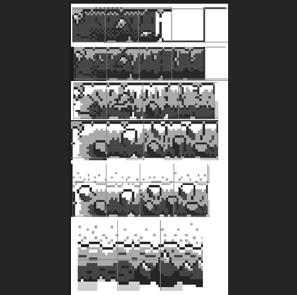
I can see that the first two walls at the top are an attempt to present a rougher and more organic wall, breaking from the minimalist wall you find in Link’s Awakening. I started with more subtle shading, implementing a sort of cross-hatching that is lighter at the top and darkest on the bottom (this style of shading in pixel art is technically known as dithering). The second iteration of the wall switches from dithering to a flat shading style and more defined lines. Although I wasn’t yet close to something that felt right, I was getting closer.
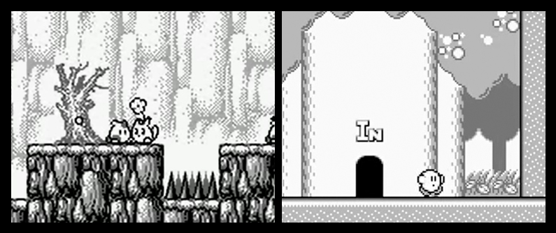
Repetitive tiles are incredibly common in Game Boy games and other earlier consoles since the programmers and artists were working with limited storage space (for example, Super Mario Bros. for the NES is 40KB in size, 8KB allocated for graphics). One game I learned about in my research was Trip World, a Game Boy game released in only the Japanese and European markets in 1992 and 1993, respectively. The game’s artwork is more detailed and less repetitive than its more popular contemporaries, giving it a slightly more mature tone than Kirby’s Dreamland, maybe the game’s closest analogue released on the same system in the same year.
Repetitive tiles are incredibly common in Game Boy games and other earlier consoles since the programmers and artists were working with limited storage space (for example, Super Mario Bros. for the NES is 40KB in size, 8KB allocated for graphics). One game I learned about in my research was Trip World, a Game Boy game released in only the Japanese and European markets in 1992 and 1993, respectively. The game’s artwork is more detailed and less repetitive than its more popular contemporaries, giving it a slightly more mature tone than Kirby’s Dreamland, maybe the game’s closest analogue released on the same system in the same year.
Some time that October, I started to look to The Legend of Zelda: The Minish Cap for inspiration. Developed by Capcom and Flagship and released in 2004 on the Game Boy Advance, The Minish Cap uses The Legend of Zelda: Wind Waker for the Gamecube as a point of graphical inspiration, giving it a different altogether look than Link’s Awakening, a game that drew its graphical touchstones from The Legend of Zelda: A Link to the Past on the SNES. With the added graphical power of the GBA and over a decade of innovation in pixel art graphics, The Minish Cap captures more detail and dimensionality with less repeated tiles and more defined shading, implying less and depicting more.
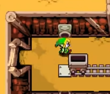

Before landing on a design that felt right for Sad Land, I tried a design that leaned into The Minish Cap’s more blocky and angular cave design. I found that on its own, it was a more confident design and matched Sad Land’s more minimalist, cartoony style, but there was something off about it. In retrospect, these walls weren’t true to my natural artistic style, which made them feel to me like a distinctively borrowed aesthetic foreign to my own sensibilities.
Inevitably I did what I do every time I get stuck with art, I put pencil to paper and doodled as a way to explore several new ideas without the pressure of locking in anything on the computer. I found myself drawing flat textured walls with these rounded stalagmites and pretty soon the final version of the cave wall came into view. There are five unique tiles that I cycle through for this wall with a separate layer for the three different clusters of stalagmites that I add as detail wherever it feels like the wall could use a flourish. Landing on something I was happy with took a lot of work but was very satisfying once it came together. The stalagmites in particular echo the pointed tip of the slime’s head, making him feel at home in the cave environment.
Inevitably I did what I do every time I get stuck with art, I put pencil to paper and doodled as a way to explore several new ideas without the pressure of locking in anything on the computer. I found myself drawing flat textured walls with these rounded stalagmites and pretty soon the final version of the cave wall came into view. There are five unique tiles that I cycle through for this wall with a separate layer for the three different clusters of stalagmites that I add as detail wherever it feels like the wall could use a flourish. Landing on something I was happy with took a lot of work but was very satisfying once it came together. The stalagmites in particular echo the pointed tip of the slime’s head, making him feel at home in the cave environment.

I’ve written far more than I intended to on this incredibly small aspect of the game, but in doing so I hope I’ve illustrated the part to represent the whole. There are so many aspects of the game from the map system to the font to the sound design that takes research and attention. Although game developers today have many modern conveniences, there is no shortcut to polish and holistic design. It takes a high degree of insight, trial and error, and informed judgement regarding what is right for the game you’re trying to make, although this is true for all artistic mediums. I will also say that experience gets you there faster. The more I work with pixel art, the more skills I have in that medium, and the less time it takes me to get to where I need to go. That said, when everything is new, everything takes time.
While I’m on the topic of how something can be difficult in many different ways, I’d like to fulfill the promise I made in last month’s newsletter to discuss NES games and why they’re so punishing…
While I’m on the topic of how something can be difficult in many different ways, I’d like to fulfill the promise I made in last month’s newsletter to discuss NES games and why they’re so punishing…
WHY WERE NES GAMES SO HARD?
NES games are known for their difficulty much more than any other console. Why is this? Did Nintendo and the other third-party developers for the Super Nintendo decide to make SNES games easier? As I’ve researched retro video games over the last few years, I’ve uncovered three separate insights that contributed to particular aspect of NES games.

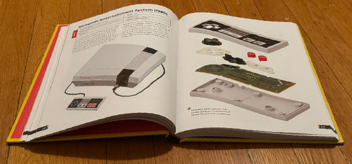
Depiction of the NES console and a breakout view of the NES controller from The Game Console by Evan Amos.
To start, the Nintendo Entertainment System was THE game console of the mid to late 80s with Sega only gaining a truly competitive market share after the release of the Sega Genesis, a system competing with Nintendo’s Super NES in the early to mid-90s. This means that if you were playing newly released console games through the 80s into the early 90s, you were playing them on an NES.
The NES library was limited in its first few years on the market both in size (according to Moby Games only 10 games released in 1983 and 20 in 1984) and in its technical capabilities, with many games in the catalog being arcade ports with static non-panning level screens (think Pac-Man and Donkey Kong). After the video game crash of 1983, the NES was a convenient way to play your arcade favorites at home and had more quality control over games released for their console, learning from Atari’s mistake. The NES had a lockout chip, meaning that a manufacturer couldn’t easily make unauthorized games for the system.
The NES library was limited in its first few years on the market both in size (according to Moby Games only 10 games released in 1983 and 20 in 1984) and in its technical capabilities, with many games in the catalog being arcade ports with static non-panning level screens (think Pac-Man and Donkey Kong). After the video game crash of 1983, the NES was a convenient way to play your arcade favorites at home and had more quality control over games released for their console, learning from Atari’s mistake. The NES had a lockout chip, meaning that a manufacturer couldn’t easily make unauthorized games for the system.

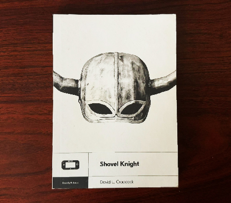
There is a chapter with the title NES HARD in the book Shovel Knight by David L. Craddock, a deep dive into the development of the 2014 NES-inspired platformer, that explores this topic at length. In this chapter, Craddock writes:
Many early NES games were formidable due to their roots in arcade development. Coin-op games were designed to make money. The harder the game, the more quarters players dropped in to continue. That mentality was transplanted into NES games in large part because it was all the industry’s budding developers knew. More intricate and balanced designs came only with time and experience.
The early days of the NES, not yet a system with sprawling worlds and save files, was rampant with easy-to-pick-up games with harsh difficulty curves.
Altered Beast was a game I loved to play as a kid but usually couldn’t get further than level 2 as the difficulty ramps up almost immediately. I didn’t find out until much later that the game was first an arcade game before being ported to the Sega Genesis, which was how I played it. The game’s specific difficulty level makes for a frustrating experience on home console, but it makes for the perfect arcade game: loud, flashy, simple to learn but hard to master gameplay, large pixel art that is readable from across the room, captivating pixel art. While not ported to the NES (in the US, anyway), Altered Beast was released in 1988 on the Sega Genesis, illustrating the persistent comingling of the arcade design philosophy leaking into console releases for the better part of a decade.
Altered Beast was a game I loved to play as a kid but usually couldn’t get further than level 2 as the difficulty ramps up almost immediately. I didn’t find out until much later that the game was first an arcade game before being ported to the Sega Genesis, which was how I played it. The game’s specific difficulty level makes for a frustrating experience on home console, but it makes for the perfect arcade game: loud, flashy, simple to learn but hard to master gameplay, large pixel art that is readable from across the room, captivating pixel art. While not ported to the NES (in the US, anyway), Altered Beast was released in 1988 on the Sega Genesis, illustrating the persistent comingling of the arcade design philosophy leaking into console releases for the better part of a decade.

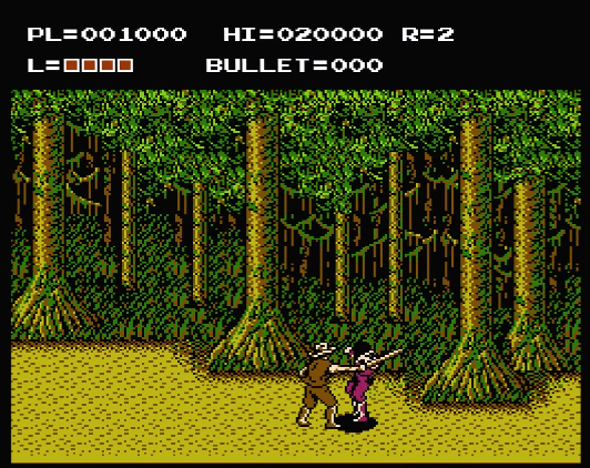
Jeremy Parish, gaming historian and author (you can find his videos on his channel Video Works and many beautiful hardcover retro-console compendiums for sale at Limited Run), recently released a video on the 1988 NES game The Adventures of Bayou Billy. In the video Parish discusses how video rental shops expanding their businesses to renting out video games changed the gaming landscape:
It represents a new way of thinking about how to sell video games in America. Where video games shops had begun to allow NES game rentals. This represented a sort of existential threat to video game publishers…Why drop $39.99 on buying a game when you could spend $2.99 and rent it for the weekend? This was a great value for kids who no longer had to risk wasting an ungodly sum of allowance, or worse, sacrificing a precious birthday gift selection on a game they’d end up hating…Konami recognizing the fact that kids were going to rent this game in America, chew it up, spit it out, and never think about it again. They retuned Mad City when it became Bayou Billy. Determined that no one should possibly be able to complete this game on a single rental, Konami cranked up the difficulty level to make Bayou Billy four times as hard as it was on Famicom (Nintendo’s Japanese NES console equivalent).
So even as game design evolved past the classic arcade style, even games developed explicitly with the home console in mind, it was still seen as financially viable to keep games difficult to ensure players couldn’t complete a game on a single rental. As a kid who rented a lot more games than I bought, I found a lot of frustration in these design choices. Having the time to complete and master a game wasn’t the reason I wanted to own them. Owning a game meant having it on-hand to experience over and over again, whether I could beat it in one hour or ten. Super Mario World’s design, for example, offered so many secrets and playstyles that getting to the end credits was secondary to exploring everything the cart had to offer.

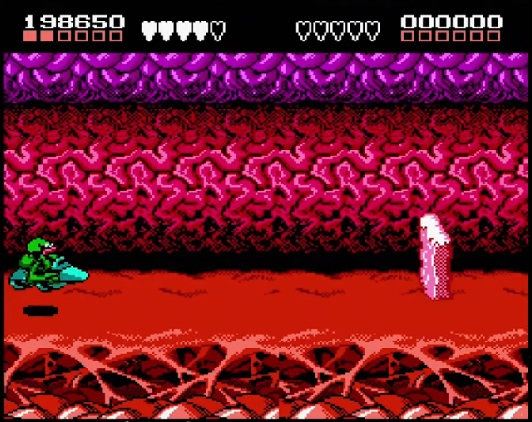
The third reason I discovered is one I came across in a Battletoads featurette on the Rare Replay connection on XBOX. Battletoads, released in 1991 and produced by RARE for the NES, is a cartoony beat ‘em up action sidescroller inspired by the success of the Teenage Mutant Ninja Turtles franchise. I loved playing through the first handful of levels as a kid whenever I rented the game or got to play it at a friend’s house but before long found it nearly impossible to progress past the fast-paced speeder bike level. To my delight, this featurette shed some light on this design decision.

“One way of getting more kind of playability,” says Greg Mayles one of several designers on the game, “was to provide the player with a decent level of challenge. Mark (Betteridge) who was leading the software effort was like a really talented player so he set the general difficulty level to around what he was good at.” In the video Kevin Bayliss, the game’s Art Director, describes the specific flavor of difficulty spearheaded by Mark, challenges that asked the player to react with precision to the “hundredth of a second.”
Game design is in many ways an exercise in empathy. Designing an experience for someone else means imagining what it’s like to encounter the challenges you present with fresh eyes and a different set of life experiences. Although I appreciate a designer having fun with development and engaging with it where their talents lie, it’s ignoring an important demographic: the kids that want to see the game you’ve made. Although I don't have any evidence that other developers of NES games had this approach, I'd be surprised if Battletoads was the only example.
Today the legacy of these types of games lives on in games in the 'masocore' subgenre (a portmanteau of "masochism" and "hardcore"). For more information on this, see Julia Alexander's 2014 Vice article Unbeatable 2D Platformers Are All the Rage Among Hardcore Gamers.

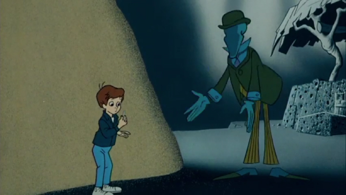
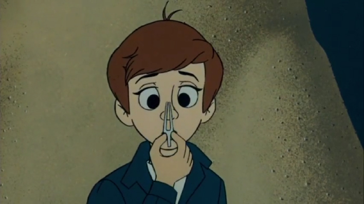
There's this scene that comes to mind when I try to catalogue all the many little things I have left on my to-do list. It’s from the 1970 (mostly) animated adaptation of the The Phantom Tollbooth. In the film, the protagonist Milo comes across the well-dressed and faceless Terrible Trivium, a self-described "demon of petty tasks and worthless jobs.” He tries to persuade Milo to move an entire mountain of sand from one spot to another using nothing but a small pair of tweezers.

I'm not saying everything in a mountain of work is trivial, but I do love how the cartoon visualizes a profound amount of work towering over our protagonist. The bleakness of the implied work it would take to complete this project rattled me to the core when I saw this on a VHS tape in elementary school. The moral illustrated in the film, beautifully directed by Chuck Jones I might add, is that “if you always do the easy and useless jobs, you’ll never have to worry about the important ones.” A helpful message for children and adults alike.
This marks my sixth monthly newsletter! I've found it personally fulfilling exploring different game design concepts and sharing my development journey and hope you have learned something by reading it. I took a trip to Rome this month (my first trip to the city and first time crossing the Atlantic in years) and plan to ruminate on some of my thoughts about the city in next month's newsletter. As long as your thinking about game design, inspiration can strike anywhere.
Sincerely,
Neil
Sincerely,
Neil